Anoosha Baxi
anoosha.baxi@gmail.com


Research
Different aspects of the existing publication was thoroughly analyzed, including: Typefaces, Type Sizes, Type Weights, Format, Grid + Column Widths, Content Inventory, Type + Editorial Style, and Type + Image.
Some high-level learnings where that:
1. Each chapter differs in type, format, and grid. The content inventory does not change between chapters.
2. Pages are split into two sections: history (which runs through the whole book) and chapter content.
3. The book is a traditional representation of publication design.
Goals
1. Develop a strict system that will result in a consistently designed book.
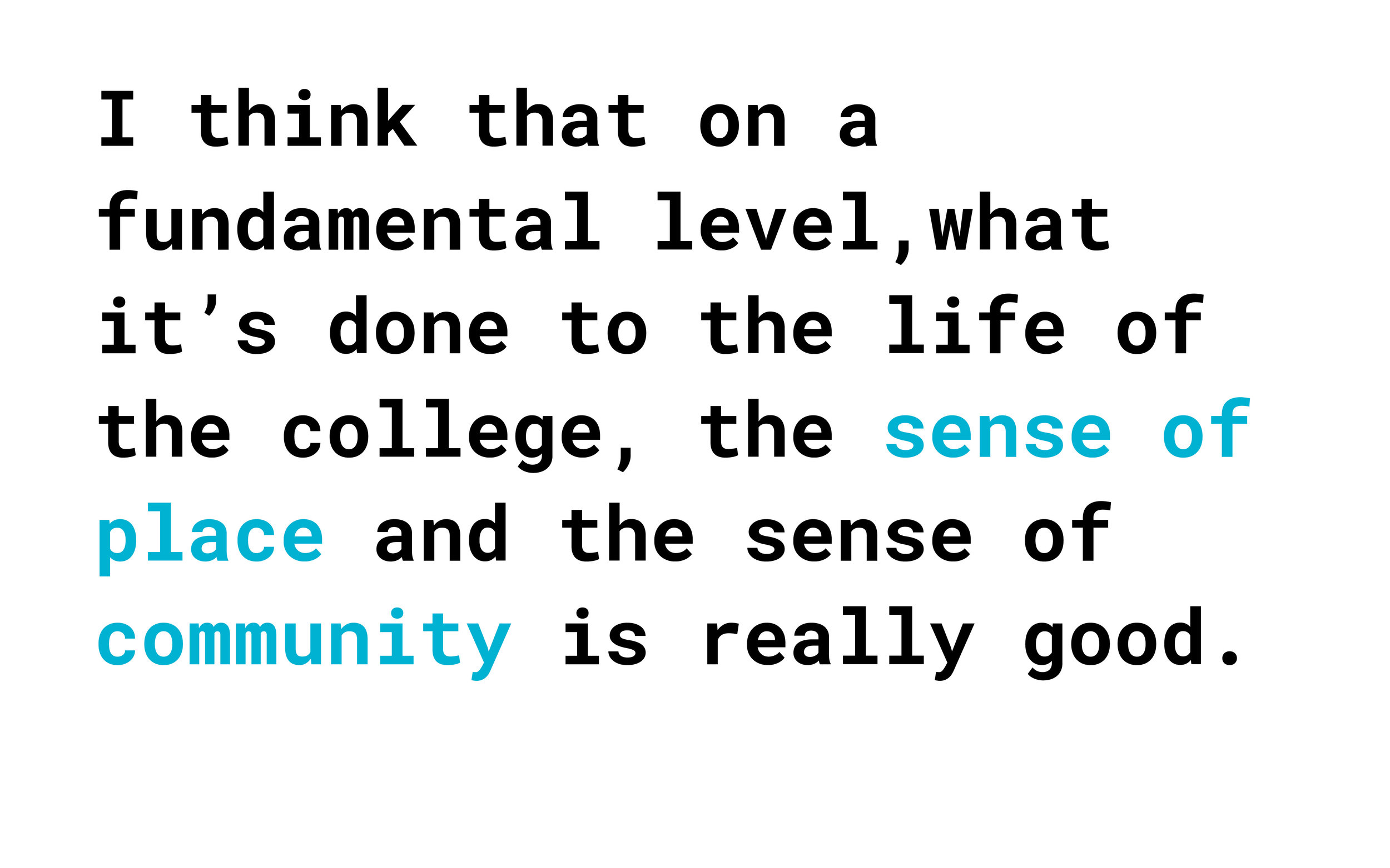
2. Design a book that represents the University of Cincinnati's College of Design, Architecture, Art, and Planning (DAAP).
Process
Concept Statement:
After setting goals for the redesign of Visions Revisions, a concept statement was drafted. After observing the work in each college and speaking to a diverse group of students, an overarching conceptual direction was established.

Type:
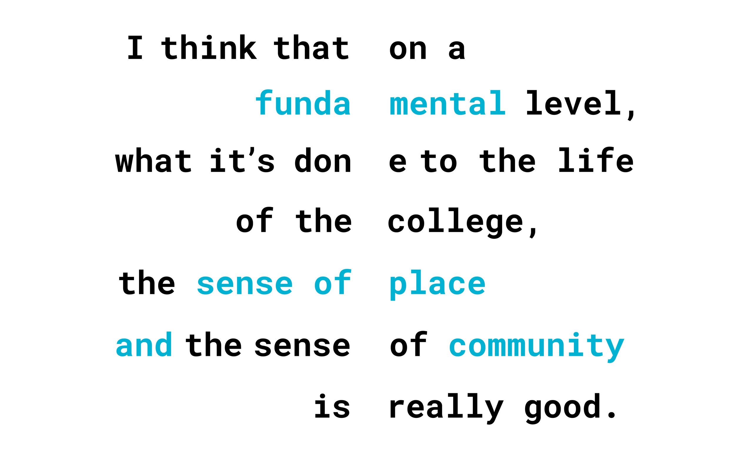
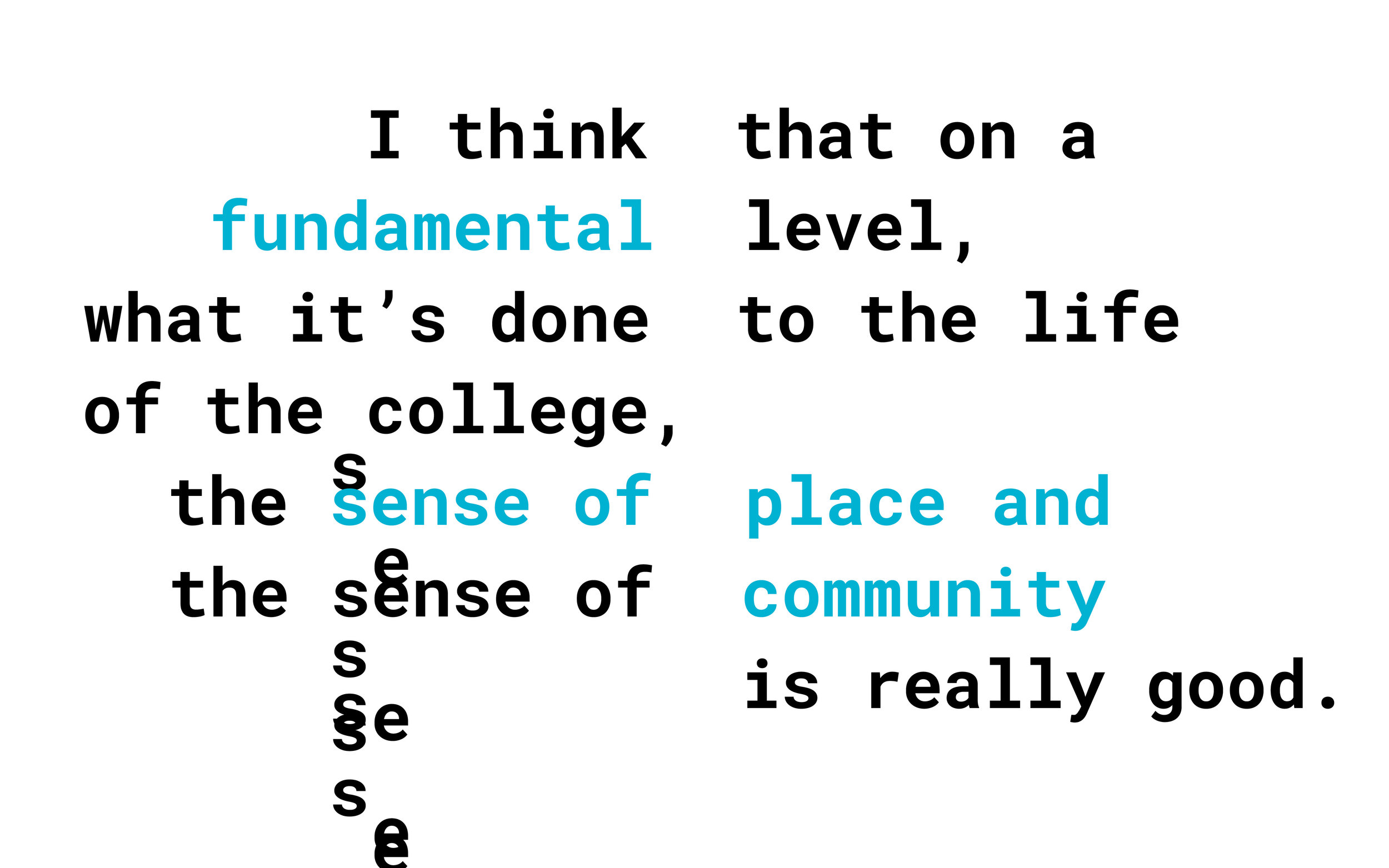
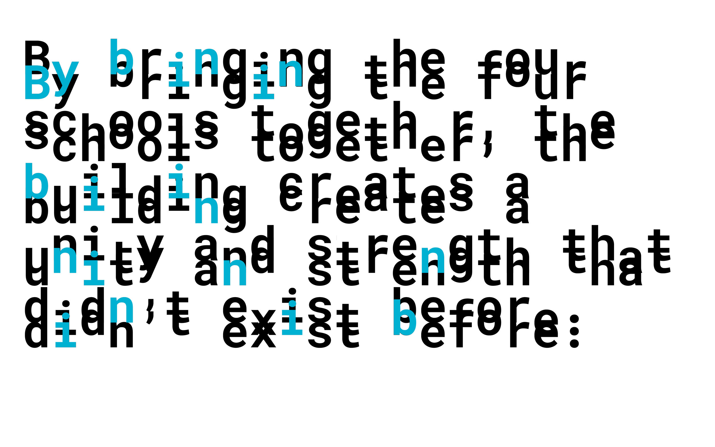
In order to select typeface sizes for optimal reading, sheets were printed with a variety of type-sizes and leadings. From these sheets as well as the reference of the combined Fibonacci scale and half-scale, ideal type-size and leading combinations were selected.
Once the body copy was selected, the same approach was used to select additional type styles including emphasis, headings, and subheadings.
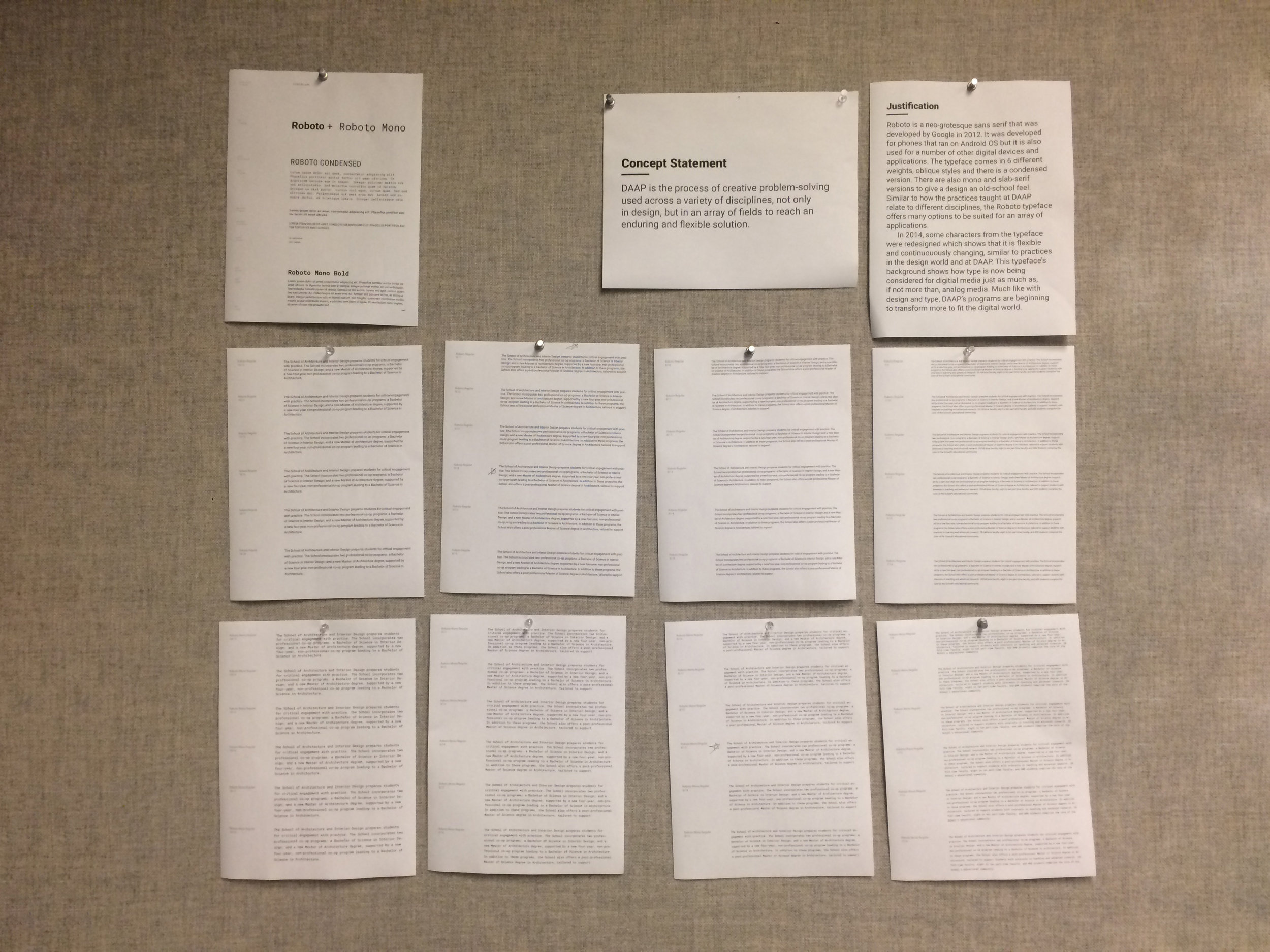
Grid:
The page dimensions of 8x10 inches were chosen because it offers a good balance between the formality of 8.5x11 and the playfulness of a square grid. The 9 column by 12-row modular grid fits well inside the page and gives the designer a lot of freedom to play with text and image placement. Even if the grid doesn’t work in its proper “3-column” increments, the grid can be broken to make an even amount of columns and offer more white space.
Visual Language:
In order to design a book that consistently follows the same rules, print standards were established. The type (sizes, styles, leading), grid, and page format were compiled into a singular document that was continuously revisited and updated as new design needs and constraints were uncovered.
These final standards lay the groundwork for the entire book.

Visual Language Application:
The print standards were then applied to a registration change slip to confirm its feasibility as a system.
Three of these slips can fit onto one 8x10 inch page which continues our system of document size.These slips are intended to be printed double sided so a student has the ability to add and drop/withdraw on the same slip if that is their desired action.

Spread Iterations:
Below are a few (of many more!) iterations that capture the essence of the progression of where each spread started to the final result.
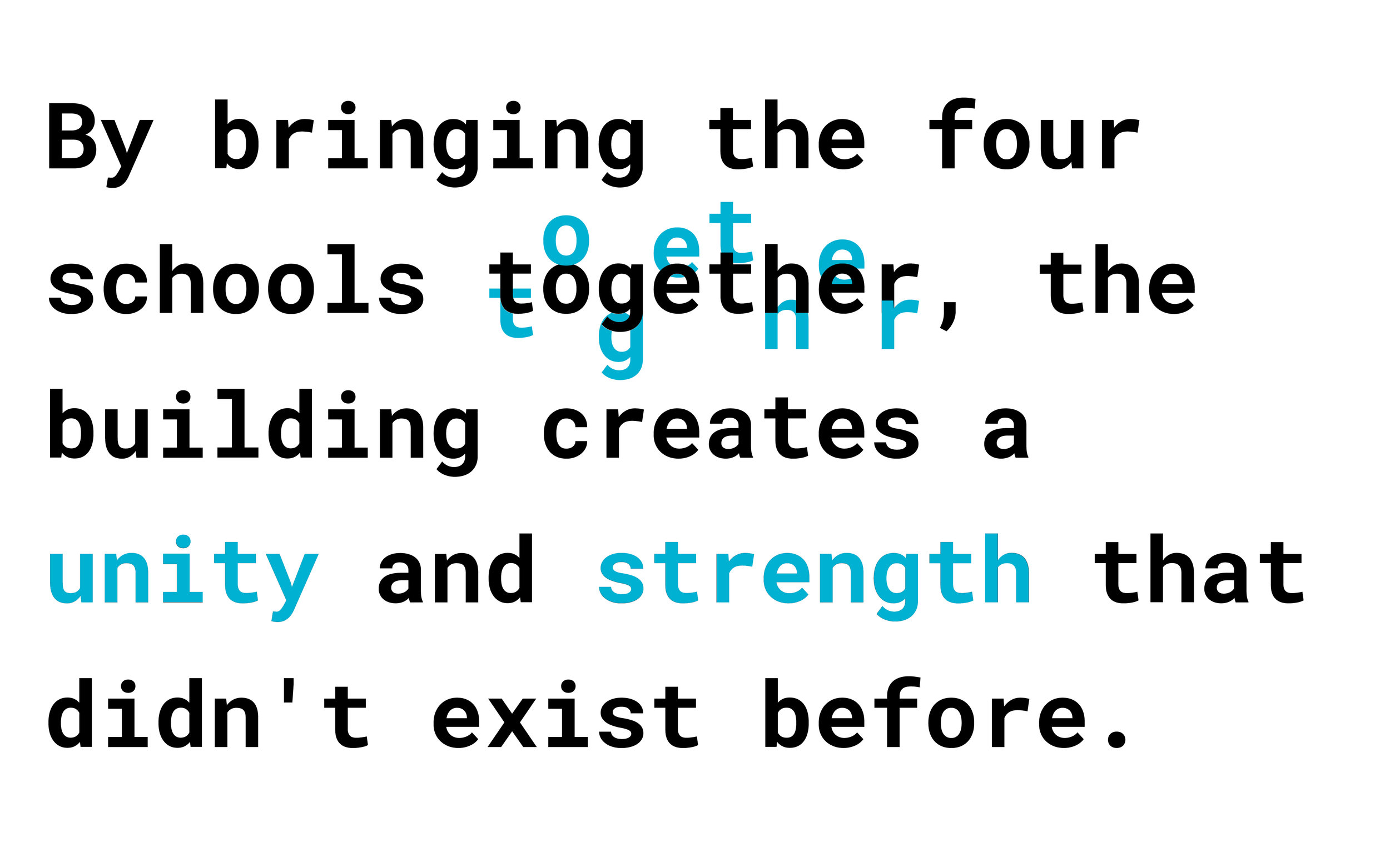
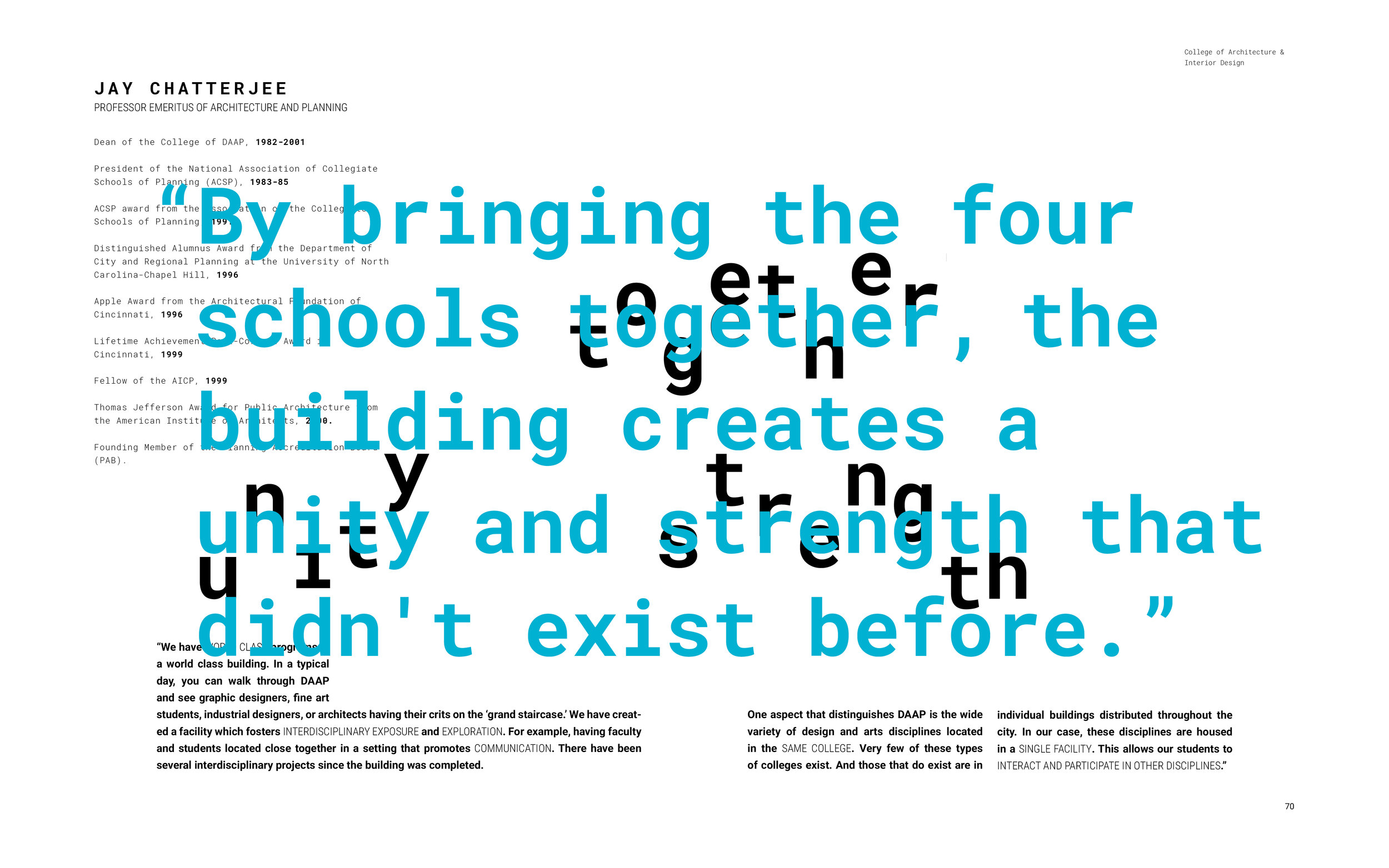
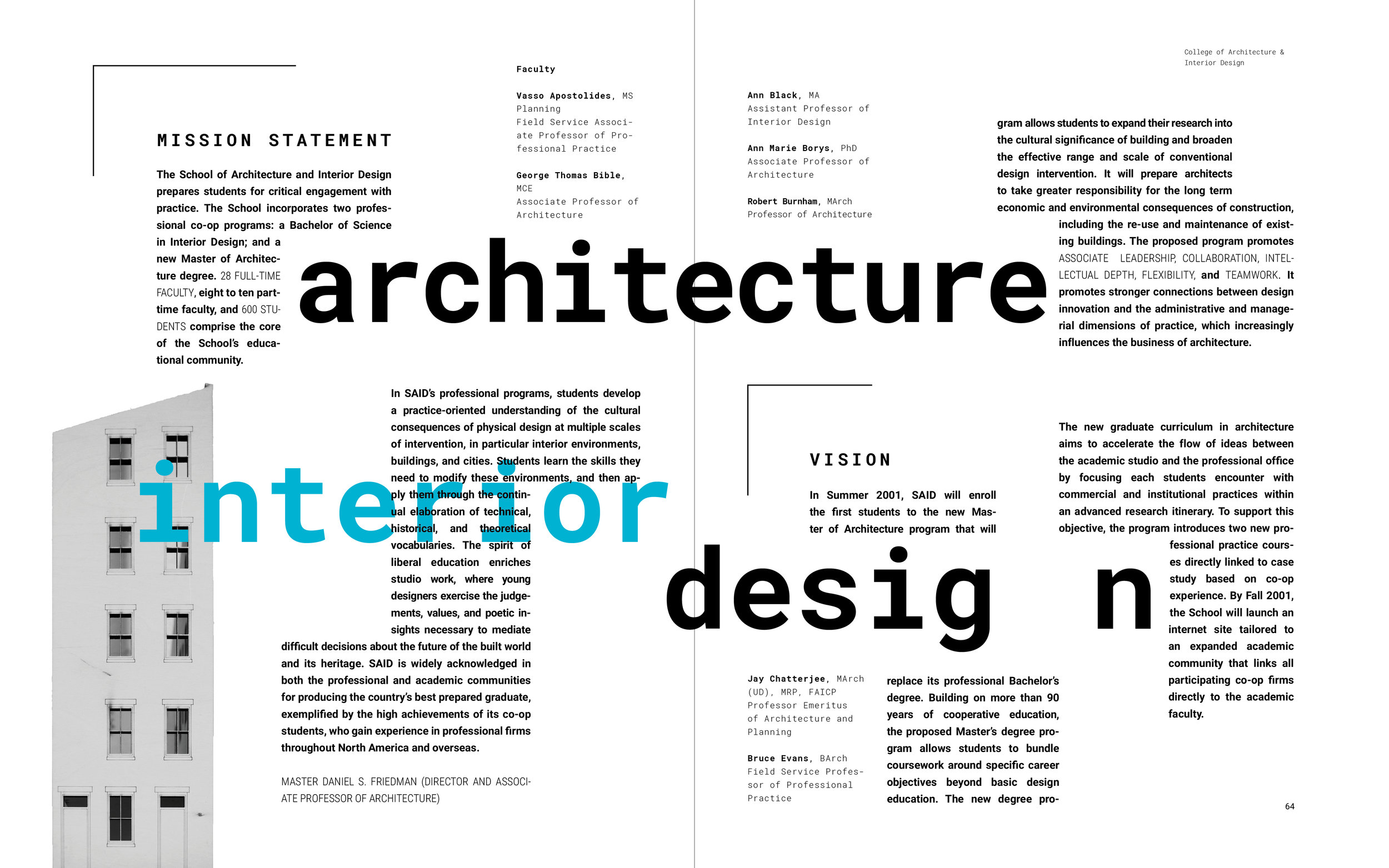
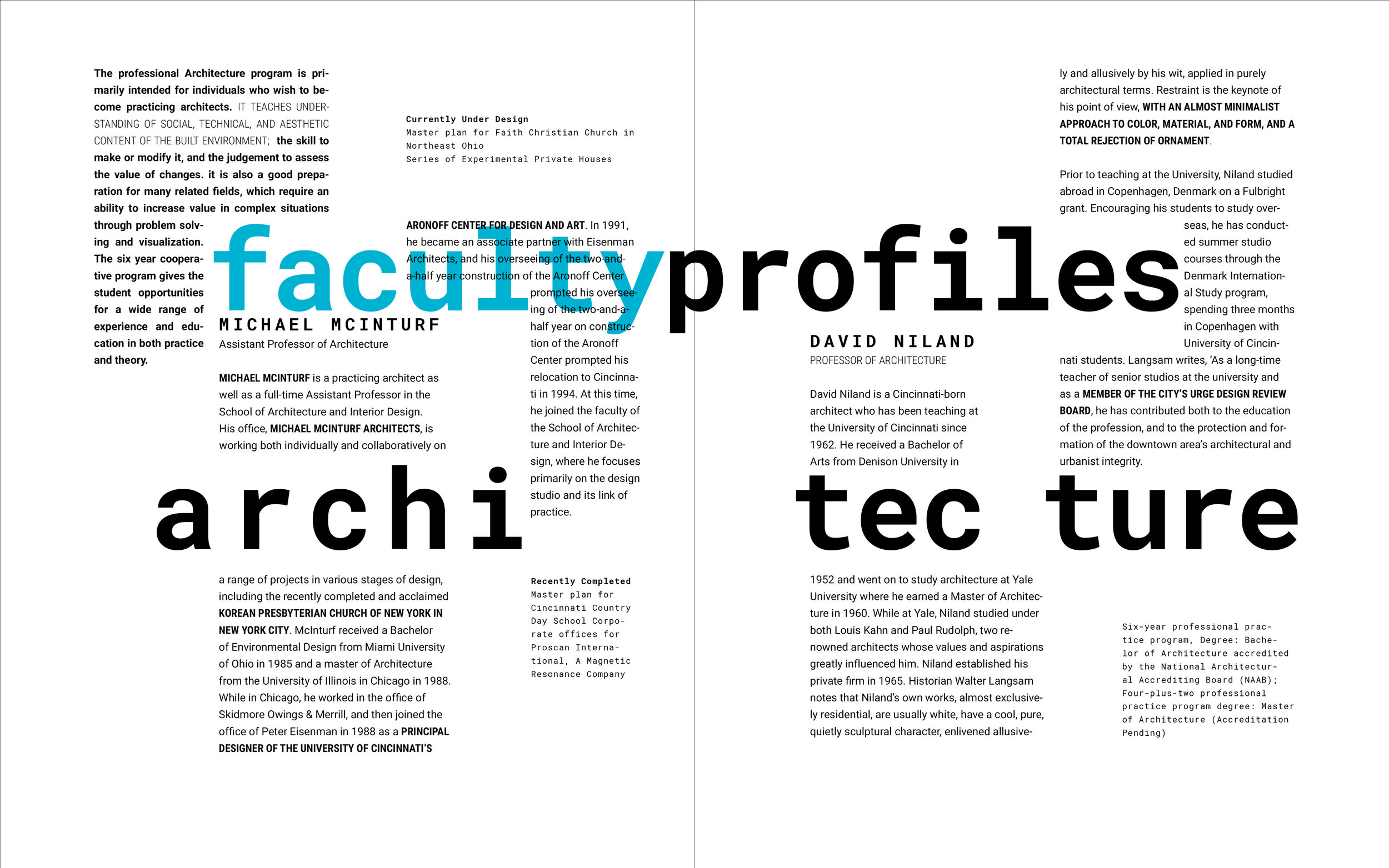
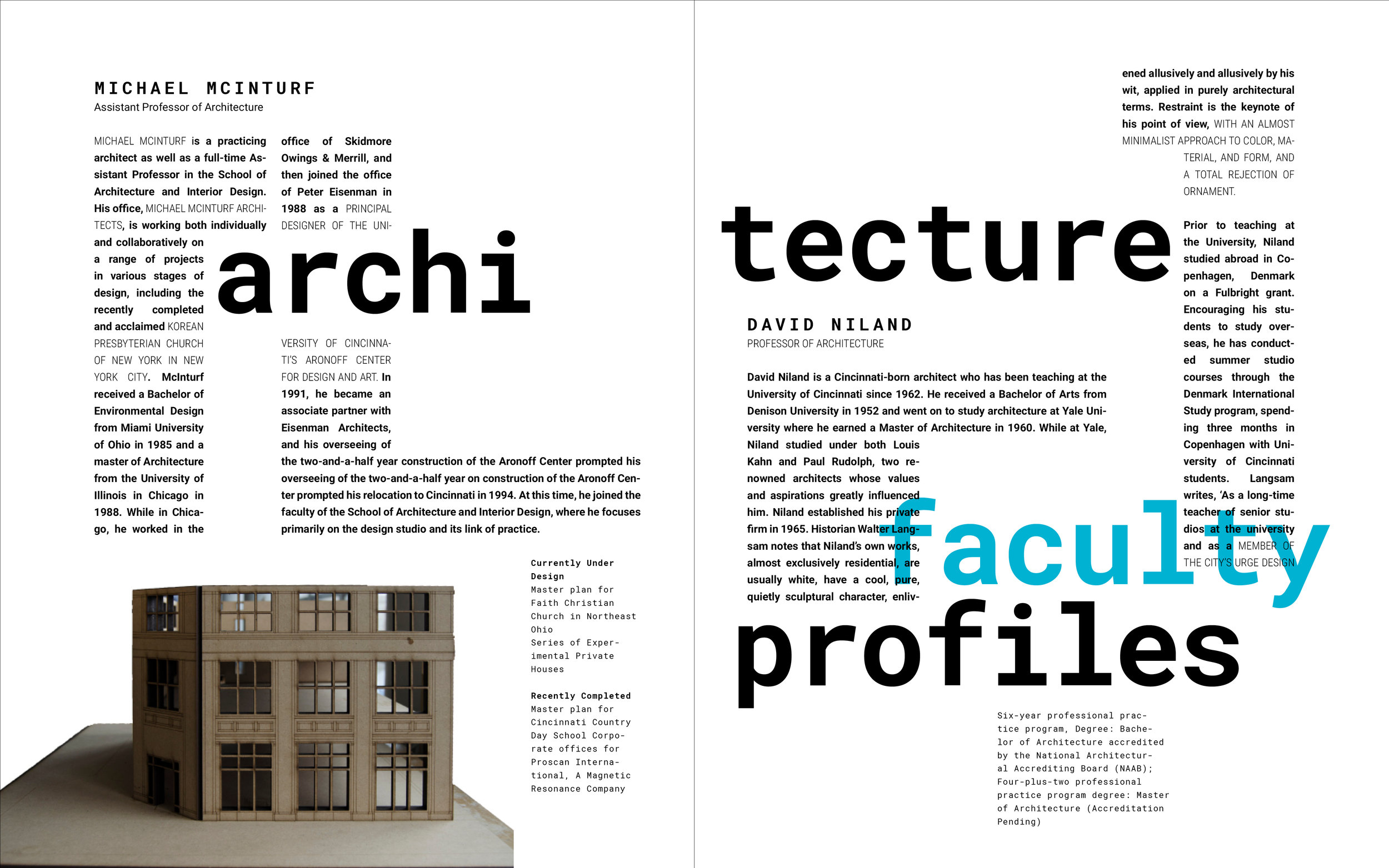
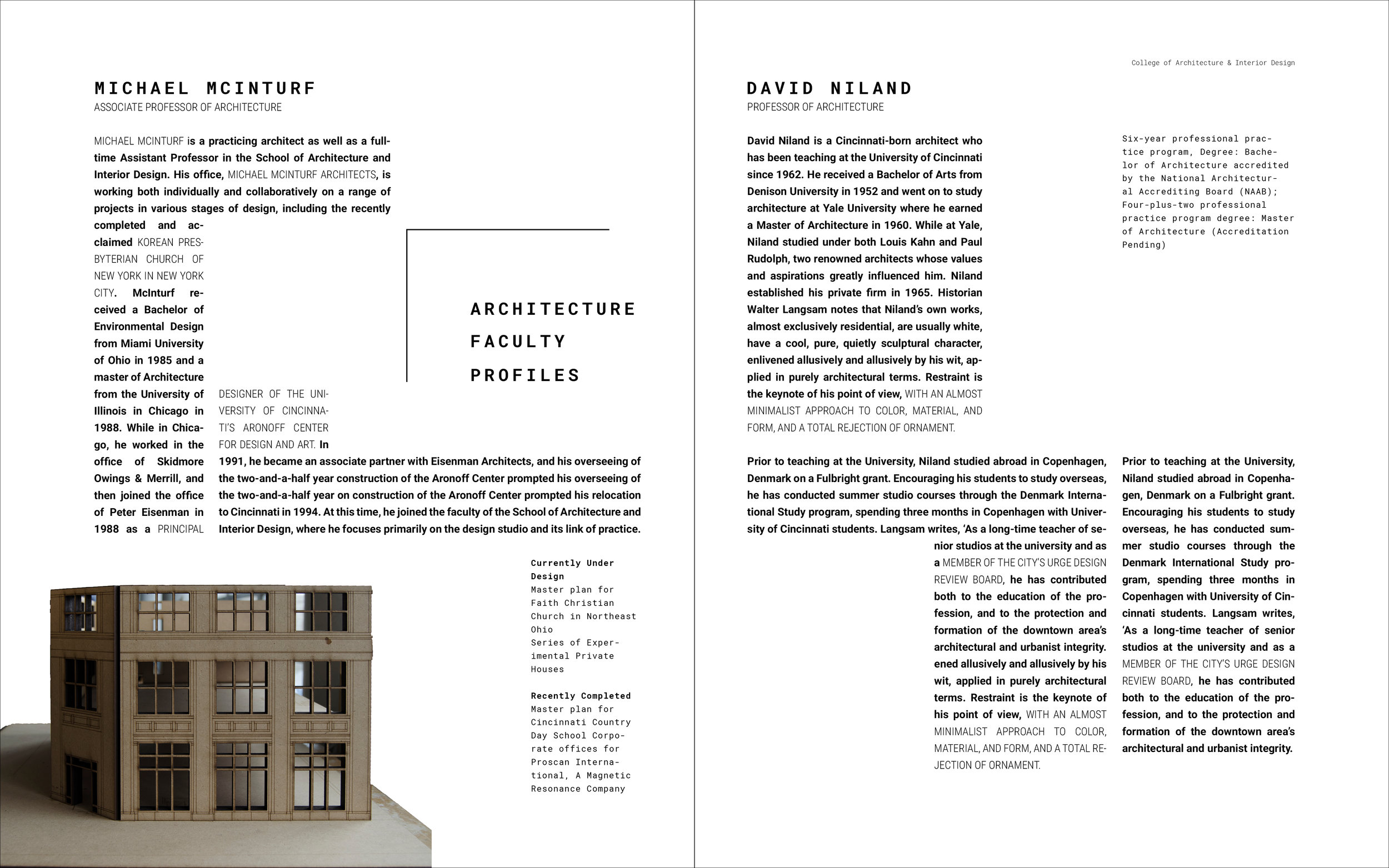
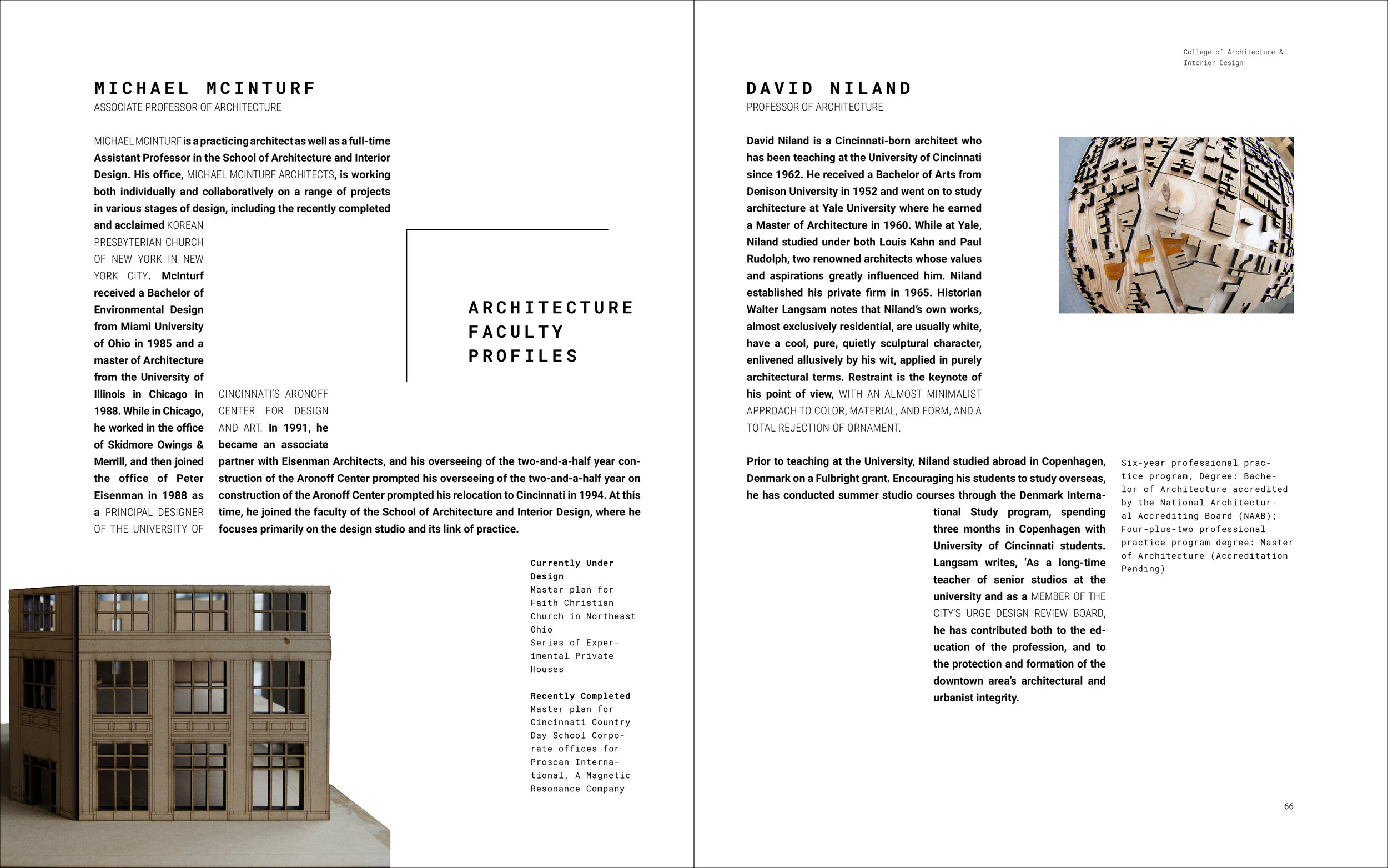
The Architecture and Interior Design spread (below, large) served as the catalyst for the direction of the publication as a whole. Once it was fleshed out and started to head in the right direction, the visual style and typographic treatments were scaled up into a framework to be applied to all other spreads.


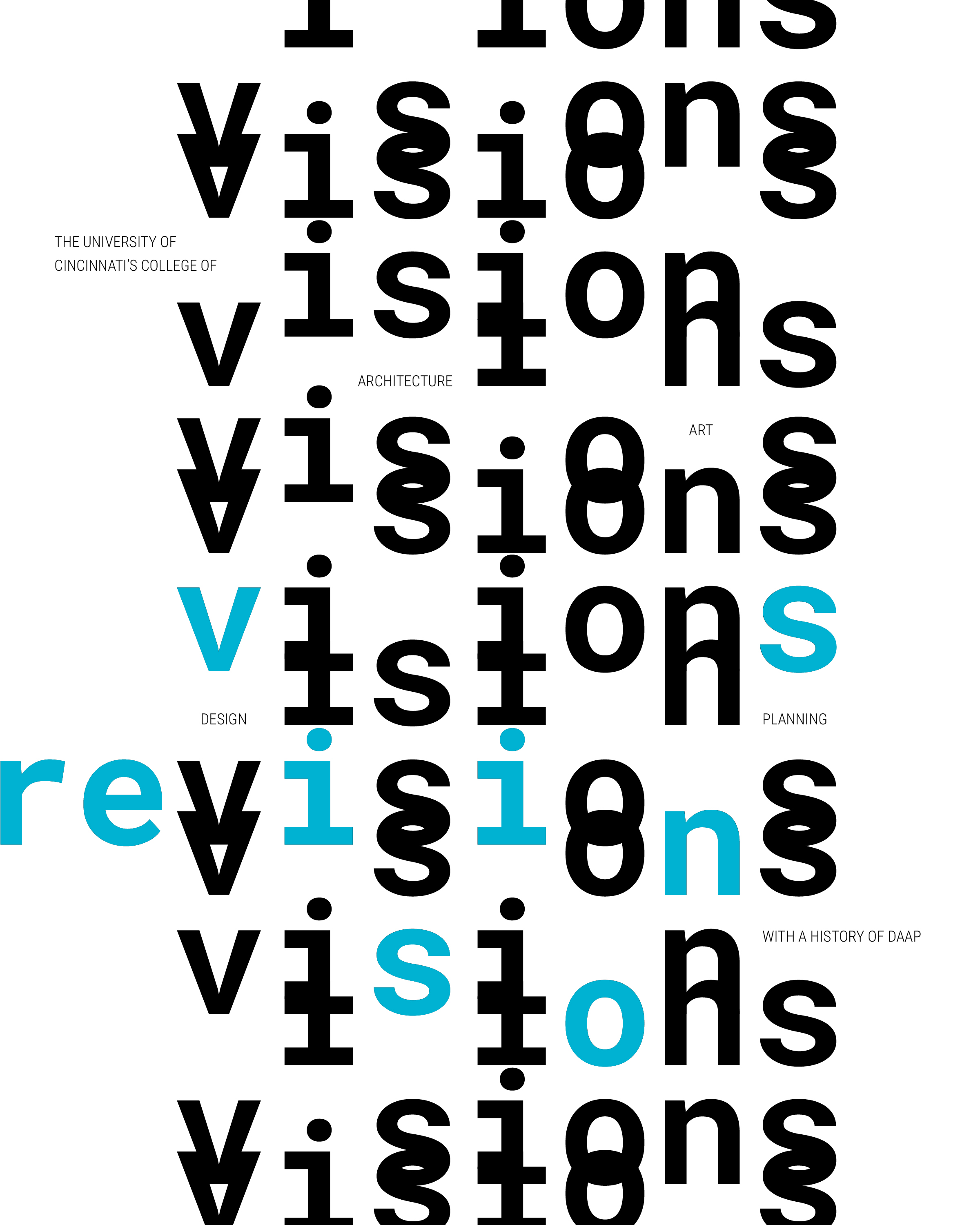
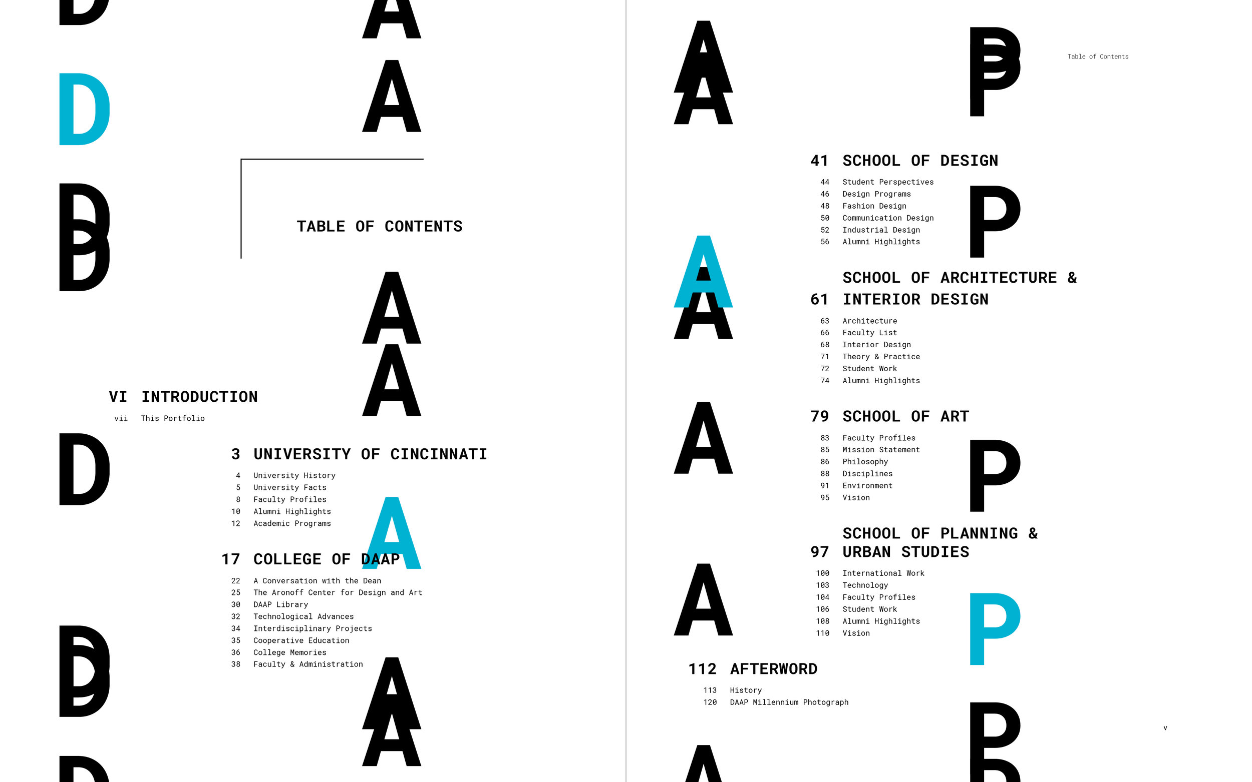
Table of Contents


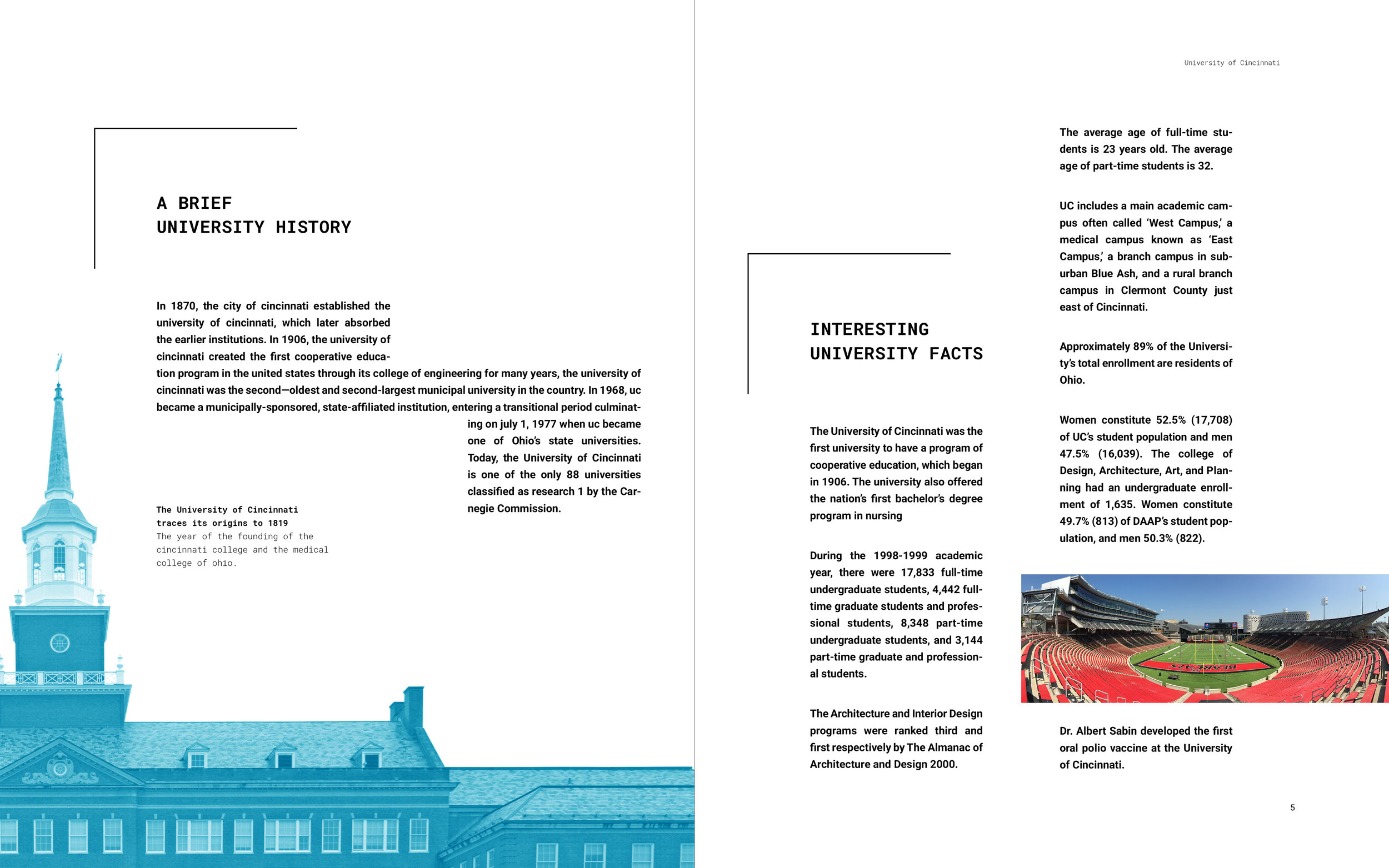
University of Cincinnati 1 (Title)


University of Cincinnati 2


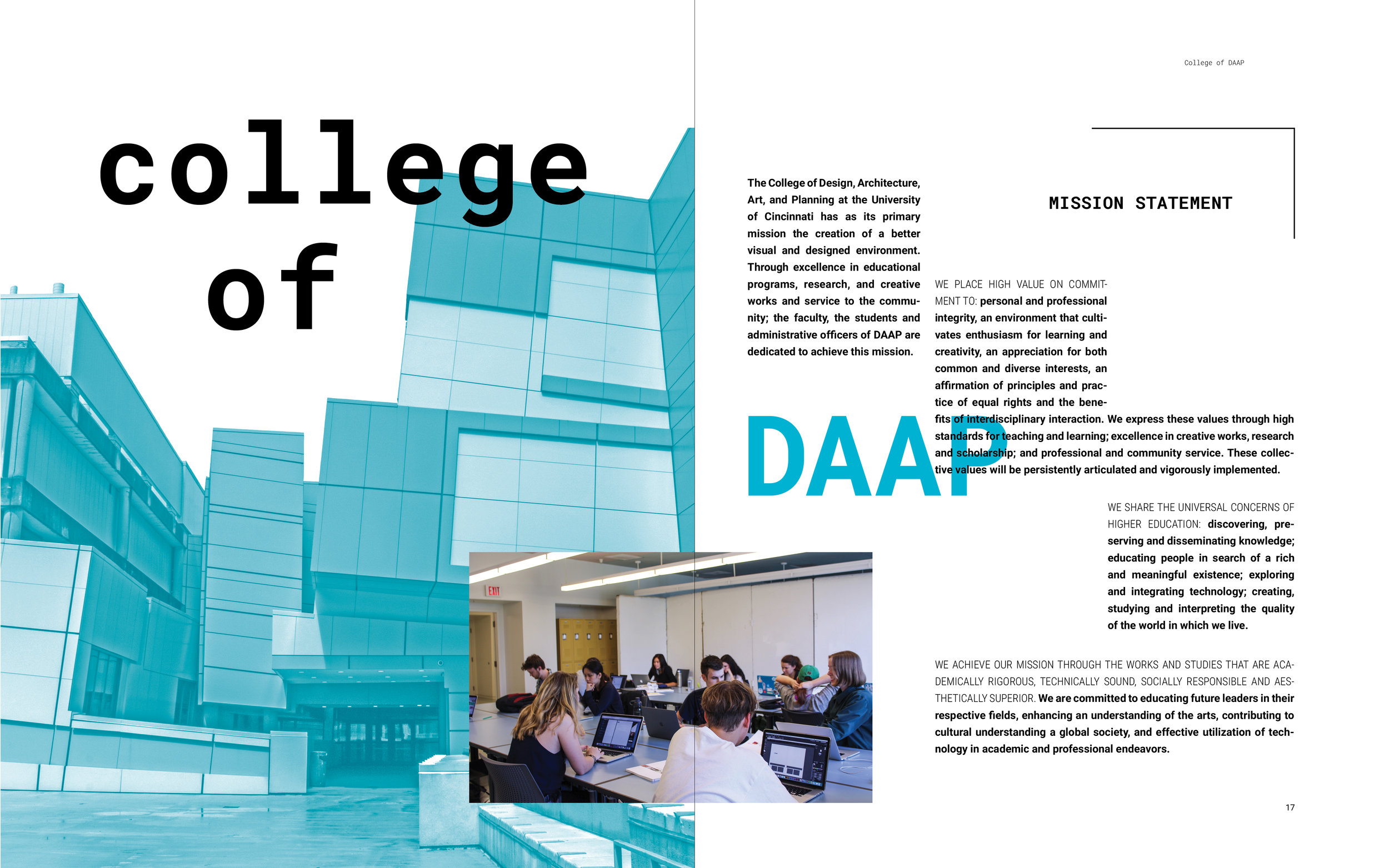
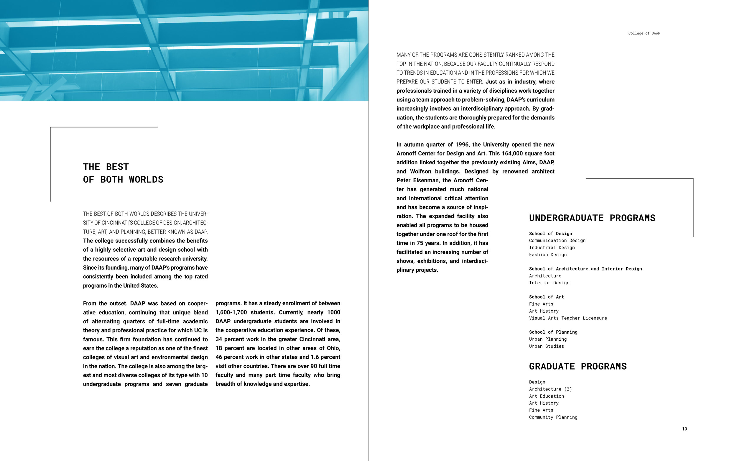
College of DAAP 1 (Title)


College of DAAP 2


School of Architecture and Interior Design (Title)
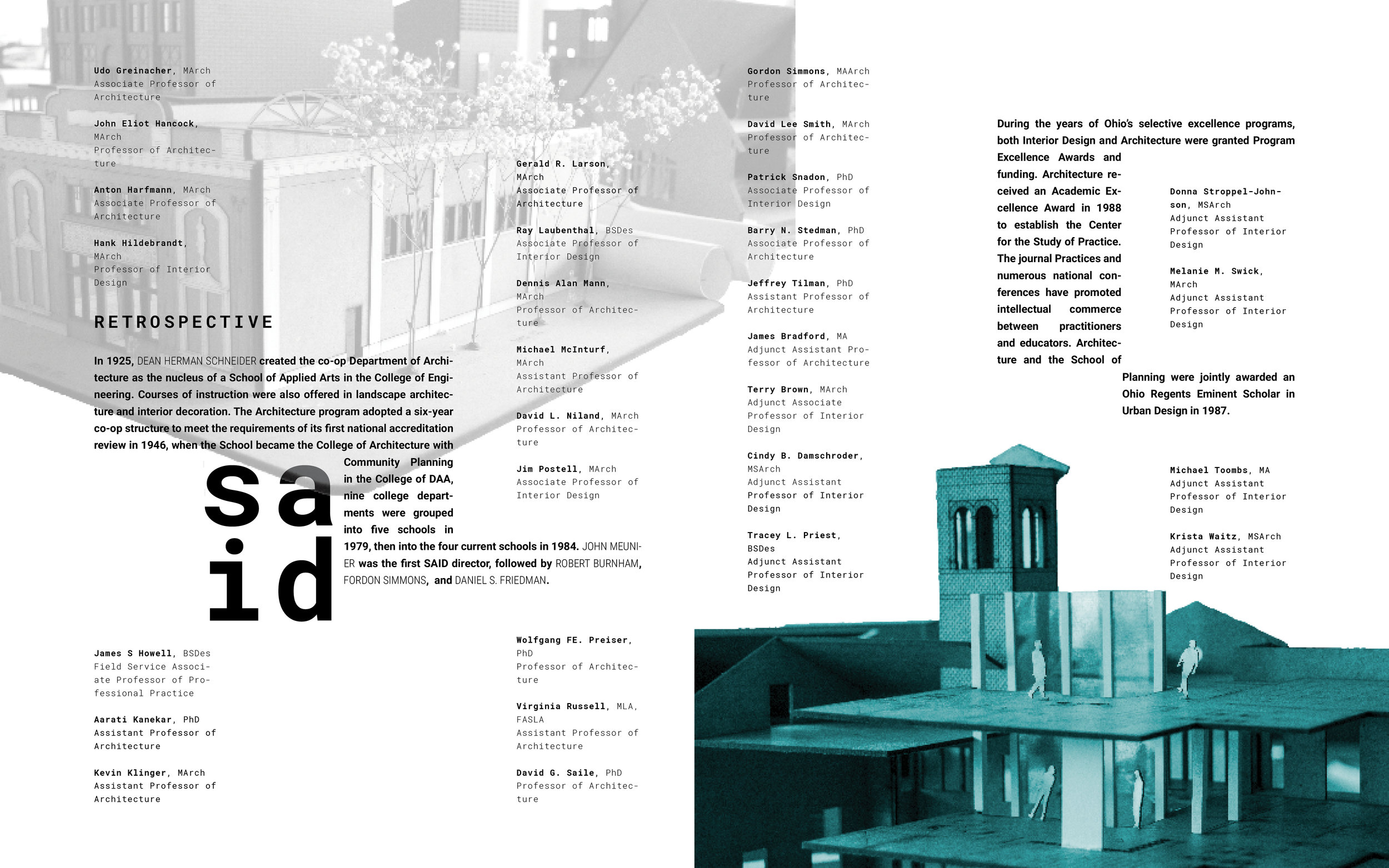
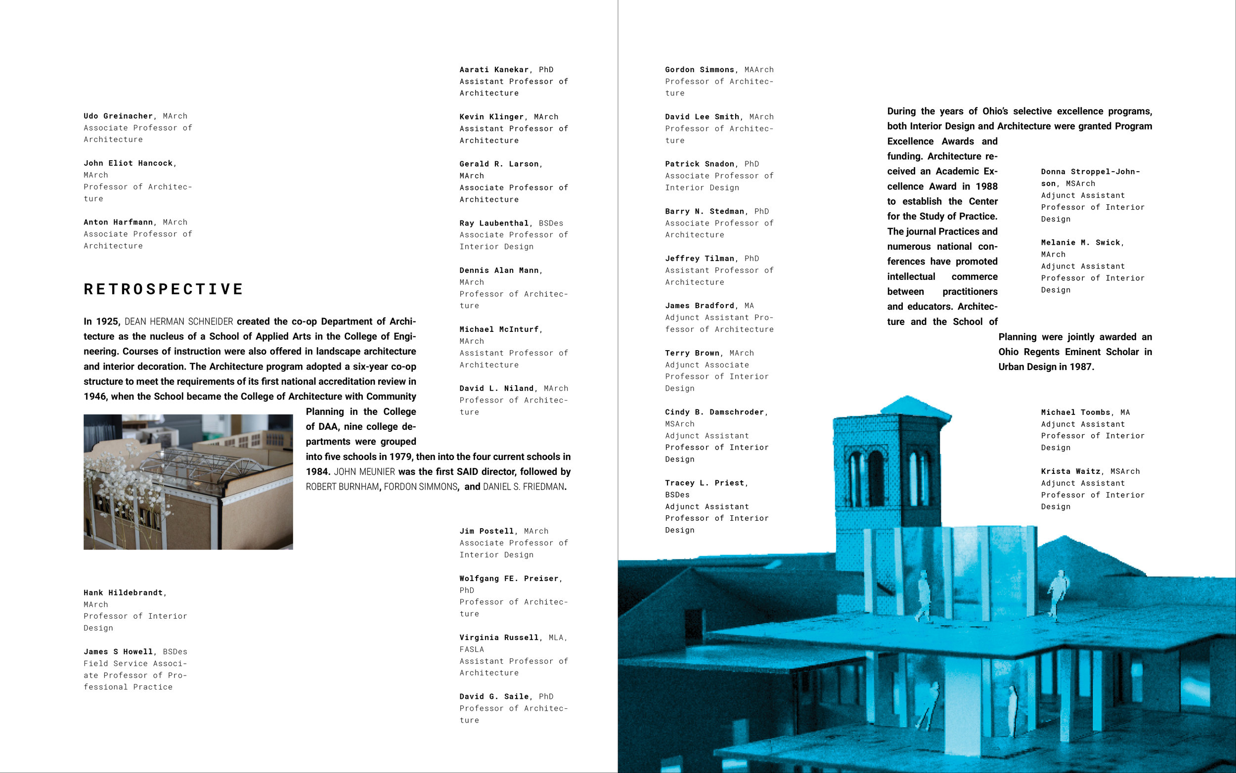
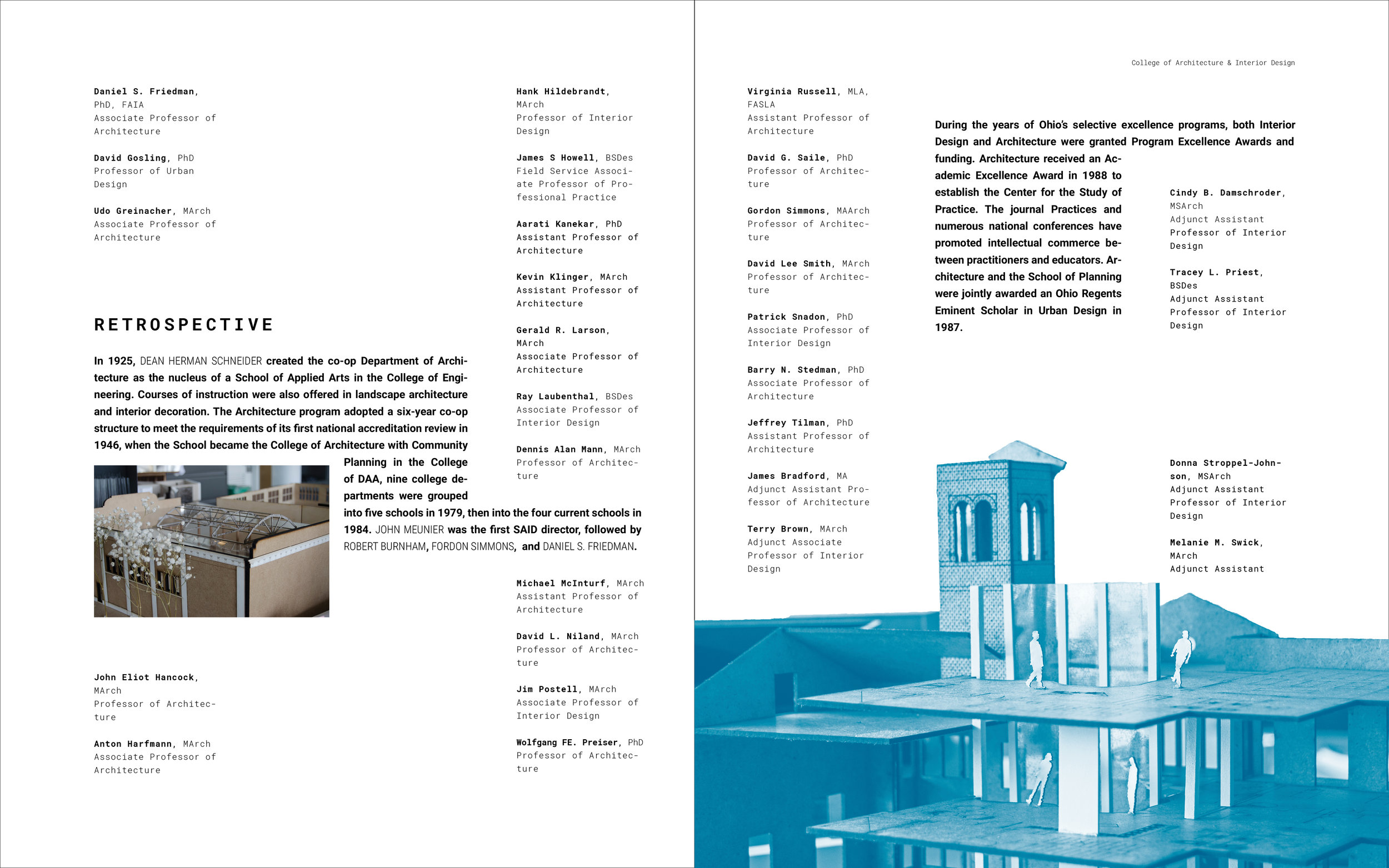
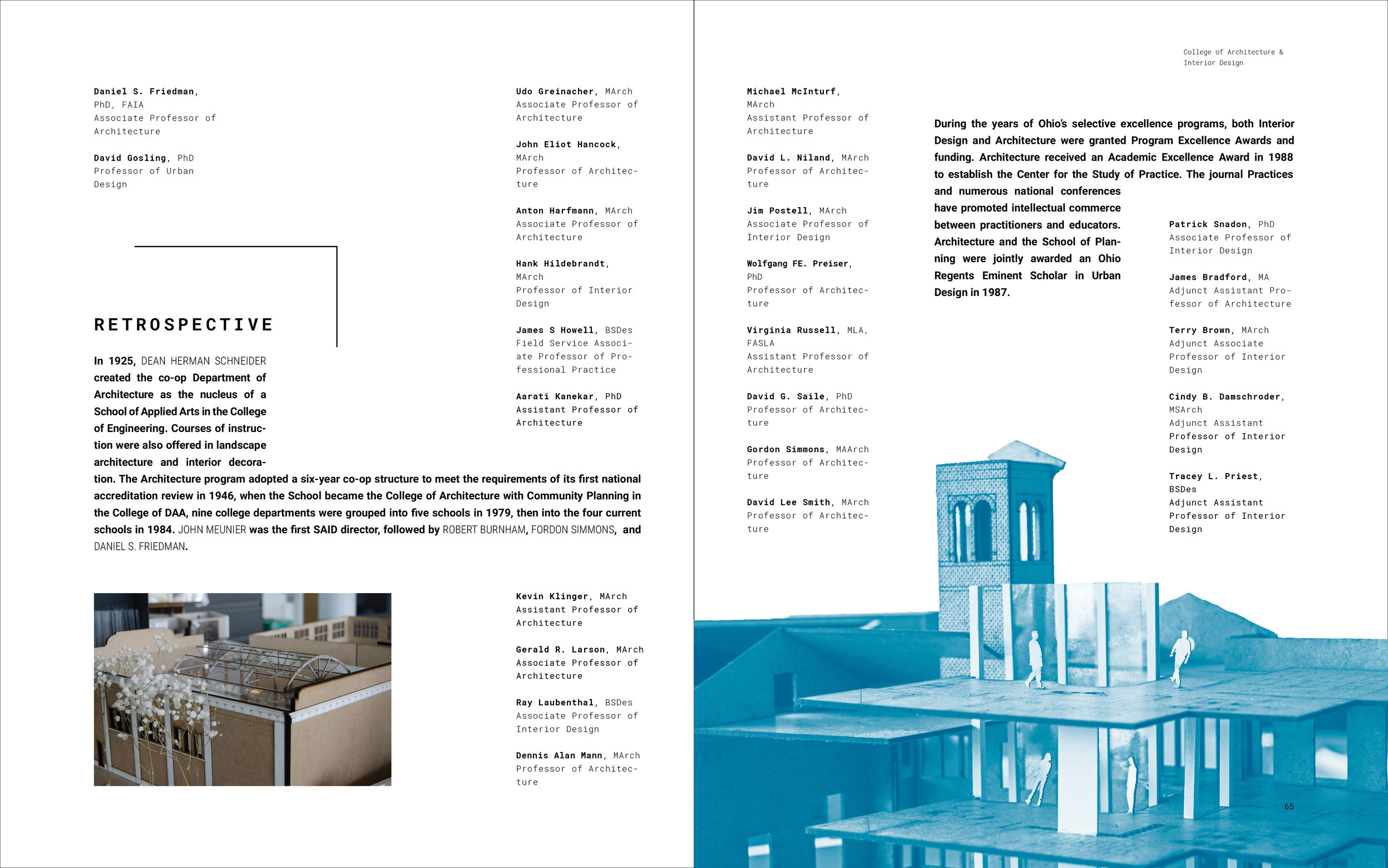
School of Architecture and Interior Design 2
Faculty Profiles
Faculty Quote